

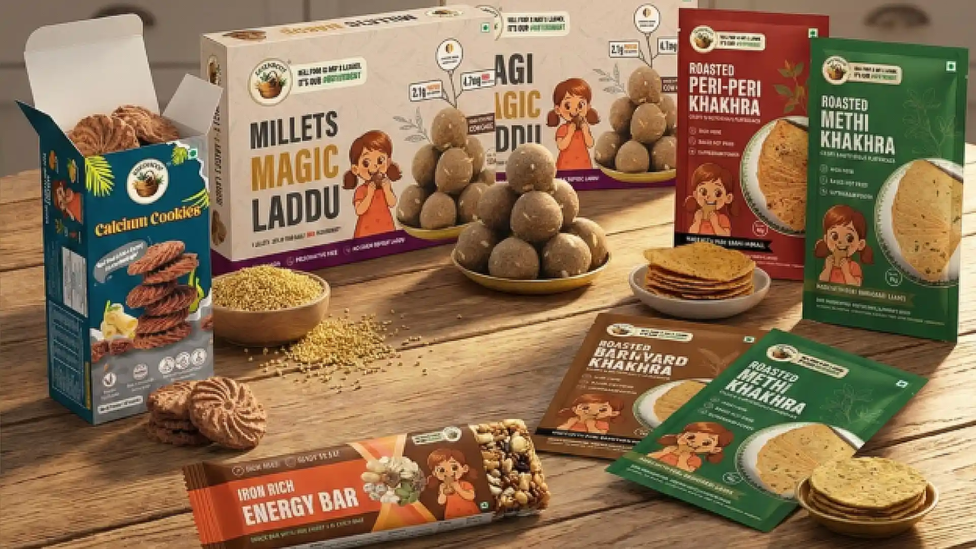
Packaging is often the first interaction people have with a product. It has just a few seconds to communicate quality, trust, and purpose.
When Essenroot partnered with us, they had a clear mission to make healthy, clean nutrition more accessible through products made with biofortified pearl millet and natural ingredients. Their products were backed by innovation, but the packaging needed to better reflect the premium quality and purpose behind the brand.
Our role was to redesign the packaging across their entire product range, creating a consistent visual identity that would strengthen shelf appeal while staying true to the brand’s values.
About the Client
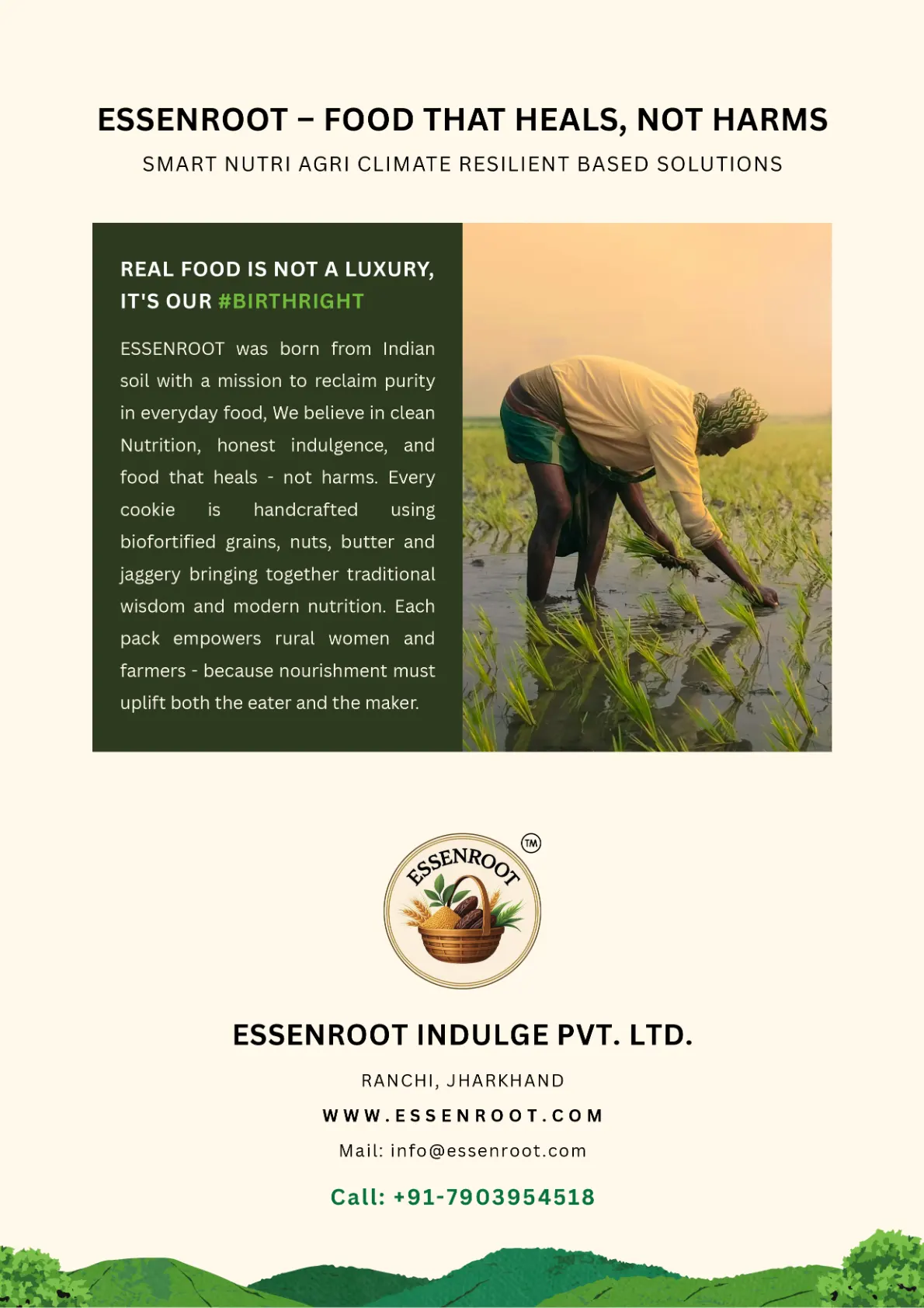
Essenroot is a nutrition focused food brand that develops healthy snacks and functional foods made with clean ingredients. The company focuses on products that are free from palm oil, refined flour, and processed sugar while promoting better nutrition through thoughtfully developed recipes.
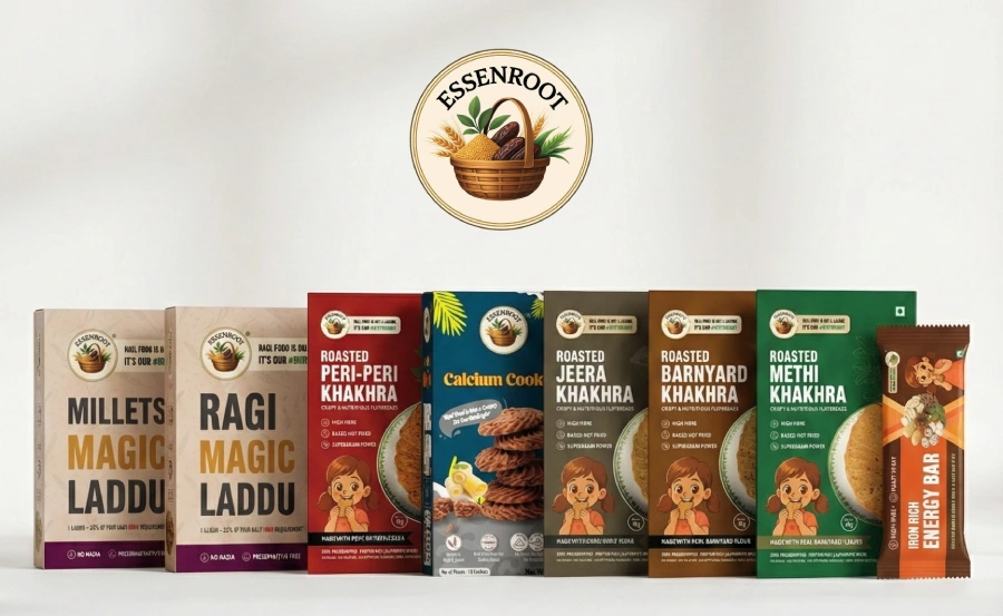
As the product portfolio continued to grow, it became important to present every product under one unified and recognizable brand identity.
The Challenge
The biggest challenge was maintaining consistency across multiple products without making every package look the same.
Each product needed its own identity while still feeling like part of one family.
We wanted the new packaging to communicate quality, highlight the natural ingredients, and create a stronger presence both on retail shelves and online marketplaces.
What We Did
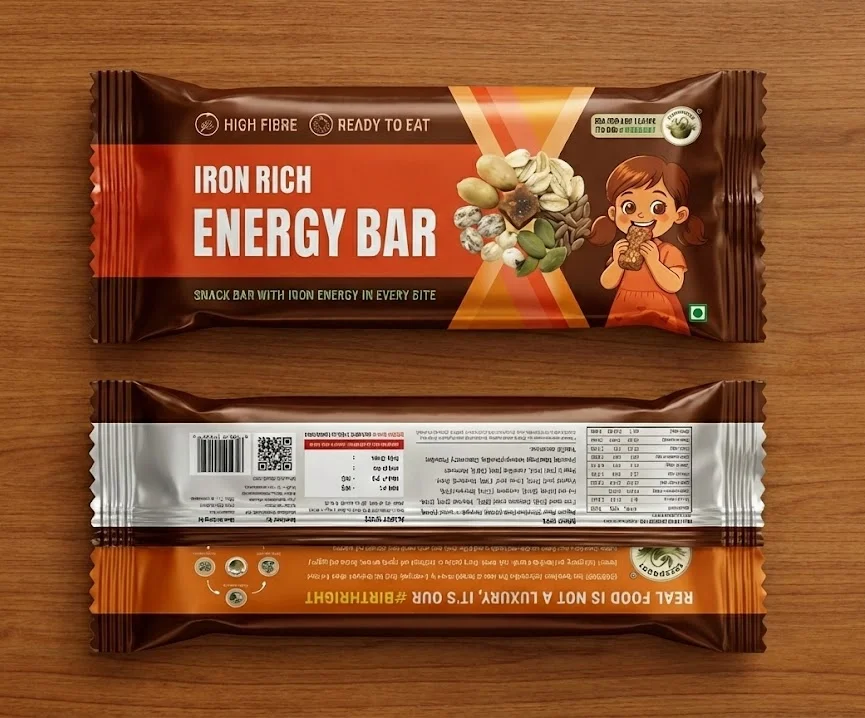
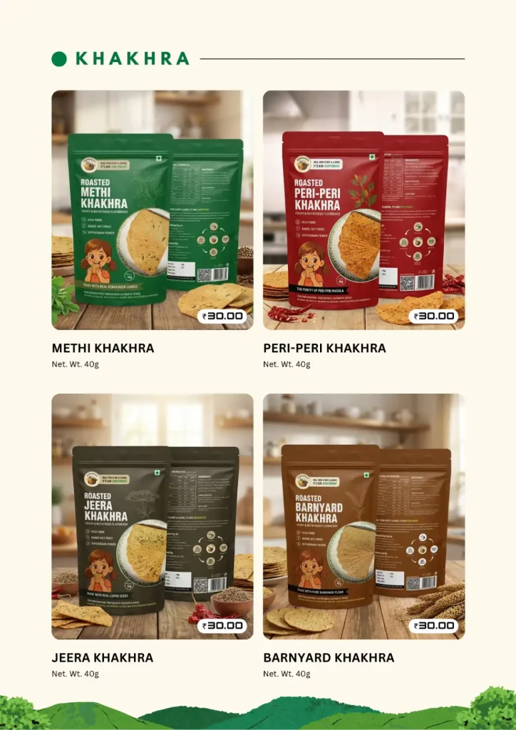
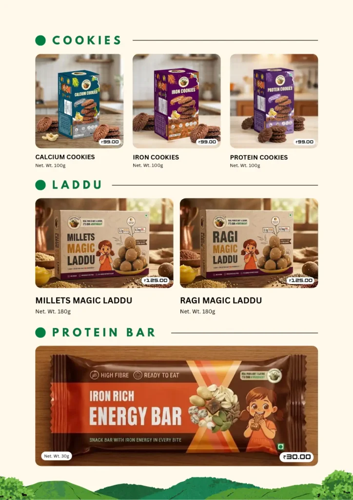
We redesigned the complete packaging system for the brand, giving every product a clean, modern, and premium appearance.
Our approach focused on creating a design language that could easily expand as new products were introduced. We refined the layout, improved the visual hierarchy, and ensured important product information remained easy to read.
The result was a packaging system that feels consistent across the entire range while allowing each product to maintain its own personality.
Design Highlights
Our redesign focused on creating packaging that feels modern and trustworthy.
Highlights of the project include:
- Unified packaging system across the product range
- Premium visual appearance
- Clear information hierarchy
- Better shelf visibility
- Consistent colour and typography system
- Packaging designed for both retail shelves and ecommerce listings
Project Metrics
| Metric | Result |
|---|---|
| Product Packaging Redesigned | Complete Product Range |
| Packaging Variants Delivered | Multiple SKUs |
| Brand Identity Consistency | 100% Across All Products |
| Core Service Delivered | Packaging Redesign |
| Design System Created | Scalable for Future Products |
Looking Ahead
A well designed package does more than protect a product. It tells a story before a customer even picks it up.
By redesigning the entire packaging range, we helped Essenroot present a stronger and more consistent brand identity that reflects the quality, innovation, and purpose behind every product. As the brand continues to introduce new products, the packaging system is ready to grow with it while maintaining a recognizable presence across every touchpoint.